Posted by Craig_Bradshaw
This post was originally in YouMoz, and was promoted to the main blog because it provides great value and interest to our community. The author’s views are entirely his or her own and may not reflect the views of Moz, Inc.
[Estimated read time: 19 minutes]
As digital marketers, the amount of data that we have to collect, process, and analyze is overwhelming. This is never more true than when we’re looking into what competitors are doing from a link building perspective.
Thankfully, there are a few things we can do to make this job a little bit easier. In this post, I want to share with you the processes I use to supercharge my analysis of competitor backlinks. In this post, you’ll learn:
- How to use URL Profiler for bulk data collection
- How to use fusion graphs to create powerful data visualizations
- How to build an SEO profile of the competition using URL Profiler and fusion tables
Use URL Profiler for bulk data collection
Working agency-side, one of the first things I do for every new client is build a profile of their main competitors, including those who have a shared trading profile, as well as those in their top target categories.
The reason we do this is that it provides a top-level overview of the industry and how competitive it actually is. This allows us to pick our battles and prioritize the strategies that will help move the right needles. Most importantly, it’s a scalable, repeatable process for building links.
This isn’t just useful for agencies. If you work in-house, you more than likely want to watch your competitors like a hawk in order to see what they’re doing over the course of months and years.
In order to do this, you’re inevitably going to need to pull together a lot of data. You’ll probably have to use a range of many different tools and data points.
As it turns out, this sort of activity is where URL Profiler becomes very handy.
For those of you who are unfamiliar with URL Profiler is, it’s a bulk data tool that allows you to collect link and domain data from thousands of URLs all at once. As you can probably imagine, this makes it an extremely powerful tool for link prospecting and research.
URL Profiler is a brilliant tool built for SEOs, by SEOs. Since every SEO I know seems to love working with Excel, the output you get from URL Profiler is, inevitably, most handy in spreadsheet format.
Once you have all this amazing bulk data, you still need to be able to interpret it and drive actionable insights for yourself and your clients.
To paraphrase the great philosopher Ben Parker: with great data power comes great tedium. I’ll be the first to admit that data can be extremely boring at times. Don’t get me wrong: I love a good spreadsheet as much as I love good coffee (more on that later); but wherever possible, I’d much rather just have something give me the actionable insights I need.
This is where the power of data visualization comes into play.
Use fusion tables for powerful data visualization
Have you ever manually analyzed one million articles to see what the impact of content format and length has on shares on links? Have you ever manually checked the backlink profile of a domain that has over half a million links? Have you ever manually investigated the breakdown of clicks and impressions your site gets across devices? Didn’t think so.
Thanks to Buzzsumo & Moz, Majestic, Ahrefs, and the Google Search Console, we don’t have to; we just use the information they give us to drive our strategy and decision-making.
The reason these tools are so popular is they allow you to input your data and discern actionable insights. Unfortunately, as already mentioned, we can’t easily get any actionable insights from URL Profiler. This is where fusion tables become invaluable.
If you aren’t already familiar with fusion tables, then the time has come for you to get acquainted with them.
Back in 2012, Google rolled out an “experimental” version of their fusion tables web application. They did this to help you get more from your data and tell the story of what’s going on in your niche with less effort. It’s best to think of fusion tables as Google’s answer to big data.
There are plenty of examples of how people are using fusion tables to tell their stories with data. However, for the purpose of brevity, I only want to focus on one incredibly awesome feature of fusion tables — the network graph.

If fusion tables are Google’s answer to big data, then the network graph feature is definitely Google’s answer to Cerebro from X-Men.
I won’t go into too many details about what network graphs are (you can read more about them here), as I would much rather talk about their practical applications for competitive analysis.
Note: There is a fascinating post on The Moz Blog by Kelsey Libert about effective influencer marketing that uses network graphs to illustrate relationships. You should definitely check that post out.
I’d been using URL Profiler and fusion tables tools in isolation of each other for quite a while — and they each worked very well — before I figured out how to combine their strengths. The result is a process that combines the pure data collection power of URL Profiler with the actionable insights that fusion graphs provide.
I’ve outlined my process below. Hopefully, it will allow you to do something similar yourself.
Build a competitive SEO profile with URL Profiler and fusion tables
To make this process easier to follow, we’ll pretend we’re entering the caffeinated, yet delicious space of online coffee subscriptions. (I’ve chosen to use this particular niche in our example for no reason other than the fact that I love coffee.) Let’s call our hypothetical online coffee subscription company “Grindhaus.”
Step 1: Assess your competition
We’ll start by looking at the single keyword “buy coffee online.” A Google search (UK) gives us the top 10 that we’ll need to crack if we want to see any kind of organic progress. The first few results look like this: 
Step 2: Gather your data
However, we’ve already said that we want to scale up our analysis, and we want to see a large cross-section of the key competitors in our industry. Thankfully, there’s another free tool that comes in handy for this. The folks over at URL Profiler offer a number of free tools for Internet marketers, one of which is called the SERP Scraper. No prizes for guessing what it does: add in all the main categories and keywords you want to target and hit scrape.

As you can see from the image above, you can do this for a specific keyword or set of keywords. You can also select which country-specific results you want to pull, as well as the total number of results you want for each query.
It should only take a minute or so to get the results of the scrape in a spreadsheet that looks something like this:

In theory, these are the competitors we’ll need to benchmark against in order for Grindhaus to see any sort of organic progress.
From here, we’ll need to gather the backlink profiles for the companies listed in the spreadsheet one at a time. I prefer to use Majestic, but you can use any backlink crawling tool you like. You’ll also need to do the same for your own domain, which will make it easier to see the domains you already have links from when it’s time to perform your analysis.
After this is done, you will have a file for your own domain, as well as a file for each one of the competitors you want to investigate. I recommend investigating a minimum of five competitors in order to obtain a data set large enough to obtain useful insights from.
Next, what we need to do is clean up the data so that we have all the competitor link data in one big CSV file. I organize my data using a simple two-column format, as follows:
- The first column contains the competitor being linked to. I’ve given this column the imaginative heading “Competitor.”
- The second column contains the domains that are linking to your competitors. I’ve labeled this column “URL” because this is the column header the URL Profiler tool recognizes as the column to pull metrics from.
Once you have done this, you should have a huge list of the referring domains for your competitors that looks something like this:

This is where the fun begins.
Step 3: Gather even more data
Next, let’s take each domain that is linking to one, some, or all of your competitors and run it through URL Profiler one at a time. Doing this will pull back all the metrics we want to see.
It’s worth noting that you don’t need any additional paid tools or APIs to use URL Profiler, but you will have to set up a couple of API keys. I won’t go into detail here on how to do this, as there are already plenty of resources explaining this readily available, including here and here. 
One of the added benefits of doing this through URL Profiler is that you can use its “Import and Merge” feature to append metrics to an existing CSV. Otherwise, you would have to do this by using some real Excel wizardry or by tediously copying and pasting extreme amounts of data to and from your clipboard.
As I’ve already mentioned, URL Profiler allows me to extract both page-level and domain-level data. However, in this case, the domain metrics are what I’m really interested in, so we’ll only examine these in detail here.
Majestic, Moz, and Ahrefs metrics
Typically, SEOs will pledge allegiance to one of these three big tools of the trade: Majestic, Moz, or Ahrefs. Thankfully, with URL Profiler, you can collect data from any or all of these tools. All you need to do is tick the corresponding boxes in the Domain Level Data selection area, as shown below. 
In most cases, the basic metrics for each of the tools will suffice. However, we also want to be able to assess the relevance of a potential link, so we’ll also need Topical Trust Flow data from Majestic. To turn this on, go to Settings > Link Metrics using the top navigation and tick the “Include Topical Trust Flow metrics” box under the Majestic SEO option.

Doing this will allow us to see the three main topics of the links back to a particular domain. The first topic and its corresponding score will give us the clearest indication of what type of links are pointing back to the domain we’re looking at.
In the case of our Grindhaus example, we’ll most likely be looking for sites that scored highly in the “Recreation/Food” category. The reason we want to do this is because relevance is a key factor in link quality. If we’re selling coffee, then links from health and fitness sites would be useful, relevant, and (more likely to be) natural. Links from engineering sites, on the other hand, would be pretty irrelevant, and would probably look unnatural if assessed by a Google quality rater.
Social data
Although the importance of social signals in SEO is heavily disputed, it’s commonly agreed that social signals can give you a good idea of how popular a site is. Collecting this sort of information will help us to identify sites with a large social presence, which in theory will help to increase the reach of our brand and our content. In contrast, we can also use this information to filter out sites with a lack of social presence, as they’re likely to be of low quality. 
Social Shares
Ticking “Social Shares” will bring back social share counts for the site’s homepage. Specifically, it will give you the number of Facebook likes, Facebook shares, Facebook comments, Google plus-ones, LinkedIn shares, and Pinterest pins.
Social Accounts
Selecting “Social Accounts” will return the social profile URLs of any accounts that are linked via the domain. This will return data across the following social networks: Twitter, Google Plus, Facebook, LinkedIn, Pinterest, YouTube, and Instagram.
Traffic
In the same way that sites with strong social signals give us an indication of their relative popularity, the same can also be said for sites that have strong levels of organic traffic. Unfortunately, without having direct access to a domain’s actual traffic figures, the best we can do is use estimated traffic.
This is where the “SEMrush Rank” option comes into play, as this will give us SEMrush’s estimation of organic traffic to any given domain, as well as a number of organic ranking keywords. It also gives us AdWords data, but that isn’t particularly useful for this exercise. 
It’s worth mentioning once more time that this is an estimate of organic traffic, not an actual figure. But it can give you a rough sense of relative traffic between the sites included in your research. Rand conducted an empirical study on traffic prediction accuracy back in June — well worth a read, in my opinion.
Indexation
One final thing we may want to look at is whether or not a domain is indexed by Google. If it hasn’t been indexed, then it’s likely that Google has deindexed the site, suggesting that they don’t trust that particular domain. The use of proxies for this feature is recommended, as it automatically queries Google in bulk, and Google is not particularly thrilled when you do this! 
After you’ve selected all the metrics you want to collect for your list of URLs, hit “Run Profiler” and go make yourself a coffee while it runs. (I’d personally go with a nice flat white or a cortado.)
For particularly large list of URLs, it can sometimes take a while, so it would probably be best to collect the data a day or two in advance of when you plan to do the analysis. For the example in this post, it took around three hours to pull back data for over 10,000 URLs. But I could have it running in the background while working on other things.
Step 4: Clean up your data
One of the downsides of collecting all of this delicious data is that there are invariably going to be columns we won’t need. Therefore, once you have your data, it’s best to clean it up, as there’s a limit on the number of columns you can have in a fusion table. 
You’ll only need the combined results tab from your URL Profiler output. So you can delete the results tab, which will allow you to re-save your file in CSV format.
Step 5: Create your new fusion table
Head on over to Google Drive, and then click New > More > Google Fusion Tables. 
If you can’t see the “Google Fusion Tables” option, you’ll have to select the “Connect More Apps” option and install Fusion Tables from there: 
From here, it’s pretty straightforward. Simply upload your CSV file and you’ll then be given a preview of what your table will look like.
Click “Next” and all your data should be imported into a new table faster than you can say “caffeine.”


Step 6: Create a network graph
Once you have your massive table of data, you can create your network graph by clicking on the small red “+” sign next to the “Cards” tab at the top of your table. Choose “Add Chart” and you’ll be presented with a range of chart options. The one we’re interested is the network graph option: 
Once you’ve selected this option, you’ll then be asked to configure your network graph. We’re primarily interested in the link between our competition and their referring domains.
However, the relationship only goes in one direction: I, the referring website, give you, the retailer, a link. Thus the connection. Therefore, we should tick the “Link is directional” and “Color by columns” options to make it easier to distinguish between the two.
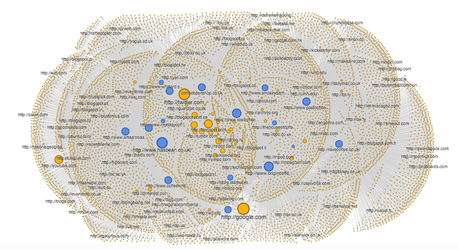
By default, the network graph is weighted by whatever is in the third column — in this case, it’s Majestic CitationFlow, so our blue nodes are sized by how high the CitationFlow is for a referring domain. Almost instantly, you can spot the sites that are the most influential based on how many sites link to them.
This is where the real fun begins.
One interesting thing to do with this visualization that will save you a lot of time is to reduce the number of visible nodes. However, there’s no science to this, so be careful you’re not missing something. 
As you increase the number of nodes shown, more and more blue links begin to appear. At around 2,000 nodes, it’ll start to become unresponsive. This is where the filter feature comes in handy, as you can filter out the sites that don’t meet your chosen quality thresholds, such as low Page Authority or a large number of outbound links.
So what does this tell us — other than there appears to be a relatively level playing field, which means there is a low barrier to entry for Grindhaus?
This visualization gives me a very clear picture of where my competition is getting their links from. 
In the example above, I’ve used a filter to only show referring domains that have more than 100,000 social shares. This leaves me with 137 domains that I know have a strong social following that would definitely help me increase the reach of my content.
You can check out the complete fusion table and network graph here.
Step 7: Find your mutant characteristics
Remember how I compared network graphs to Google’s answer to Cerebro from X-Men? Well, this is where I actually explain what I meant.
For those of you that are unfamiliar with the X-Men universe, Cerebro is a device that amplifies the brainwaves of humans. Most notably, it allows telepaths to distinguish between humans and mutants by finding the presence of the X-gene in a mutant’s body.
Using network graphs, we can specify our own X-gene and use it to quickly find high-quality and relevant link opportunities. For example, we could include sites that have a Domain Authority greater than or equal to 50:

For Grindhaus, this filter finds 242 relevant nodes (from a total of 10,740 total nodes). In theory, these are domains Google would potentially see as being more trustworthy and authoritative. Therefore, they should definitely be considered as potential link-building opportunities.
You should be able to see that there are some false positives in here, including Blogspot, Feedburner, and Google. However, these are outweighed by an abundance of extremely authoritative and relevant domains, including Men’s Health, GQ Magazine, and Vogue.co.uk.
Sites that have “Recreation/Food” as their primary Topical Trust Flow Topic:

This filter finds 361 relevant nodes out of a total of 10,740 nodes, which all have “Recreation/Food” as their primary Topical Trust Flow Topic.
Looking at this example in more detail, we see that another cool feature of network graphs is that the nodes that have the most connections are always in the center of the graph. This means you can quickly identify the domains that link to more than one of your competitors, as indicated by the multiple yellow lines. This works in a similar way to Majestic’s “Click Hunter” feature and Moz’s “Link Intersect” tool.
However, you can do this on a much bigger scale, having a wider range of metrics at your fingertips.

In this case, toomuchcoffee.com, coffeegeek.com, and beanhunter.com would be three domains I would definitely investigate further in order to see how I could get a link from them for my own company.
Sites that are estimated to get over 100,000 organic visits, weighted by social shares:

For our Grindhaus, this filter finds 174 relevant nodes out of 10,740, which are all estimated to receive more than 100,000 organic visits per month. However, I have also weighted these nodes by “Homepage Total Shares.” This allows me to see the sites that have strong social followings and have also been estimated to receive considerable amounts of organic traffic (i.e., “estimorganic” traffic).
By quickly looking at this network graph, we can immediately see some authoritative news sites such as The Guardian, the BBC, and the Wall Street Journal near the center, as well as quite a few university sites (as denoted by the .ac.uk TLD).
Using this data, I would potentially look into reaching out to relevant editors and journalists to see if they’re planning on covering National Coffee Week and whether they’d be interested in a quote from Grindhaus on, say, coffee consumption trends.
For the university sites, I’d look at reaching out with a discount code to undergraduate students, or perhaps take it a bit more niche by offering samples to coffee societies on campus like this one.
This is barely scratching the surface of what you can do with competitor SEO data in a fusion table. SEOs and link builders will all have their own quality and relevance thresholds, and will also place a particular emphasis on certain variables, such as Domain Authority or total referring domains. This process lets you collect, process, and analyze your data however you see fit, allowing you to quickly find your most relevant sites to target for links.
Step 8: Publish and share your amazing visualization
Now that you have an amazing network graph, you can embed it in a webpage or blog post. You can also send a link by email or IM, which is perfect for sharing with other people in your team, or even for sharing with your clients so you can communicate the story of the work you’re undertaking more easily.
Note: Typically, I recommend repeating this process every three months.
Summary and caveats
Who said that competitive backlink research can’t be fun? Aside from being able to collect huge amounts of data using URL Profiler, with network graphs you can also visualize the connections between your data in a simple, interactive map.
Hopefully, I’ve inspired you to go out and replicate this process for your own company or clients. Nothing would fill me with more joy than hearing tales of how this process has added an extra level of depth and scale to your competitive analysis, as well as given you favorable results.
However, I wouldn’t be worth my salt as a strategist if I didn’t end this post with a few caveats:
Caveat 1: Fusion tables are still classed as “experimental,” so things won’t always run smoothly. The feature could also disappear altogether overnight, although my fingers (and toes) are crossed that it doesn’t.
Caveat 2: Hundreds of factors go into Google’s ranking algorithm, and this type of link analysis alone does not tell the full story. However, links are still seen as an incredibly important signal, which means that this type of analysis can give you a great foundation to build on.
Caveat 3: To shoehorn one last X-Men analogy in… using Cerebro can be extremely dangerous, and telepaths without well-trained, disciplined minds put themselves at great risk when attempting to use it. The same is true for competitive researchers. However, poor-quality link building won’t result in insanity, coma, permanent brain damage, or even death. The side effects are actually much worse!
In this age of penguins and penalties, links are all too often still treated as a commodity. I’m not saying you should go out and try to get every single link your competitors have. My emphasis is on quality over quantity. This is why I like to thoroughly qualify every single site I may want to try and get a link from. The job of doing competitive backlink research using this method is to assess every possible option and filter out the websites you don’t want links from. Everything that’s left is considered a potential target.
I’m genuinely very interested to hear your ideas on how else network graphs could be used in SEO circles. Please share them in the comments below.
Sign up for The Moz Top 10, a semimonthly mailer updating you on the top ten hottest pieces of SEO news, tips, and rad links uncovered by the Moz team. Think of it as your exclusive digest of stuff you don’t have time to hunt down but want to read!
Source: MOZ